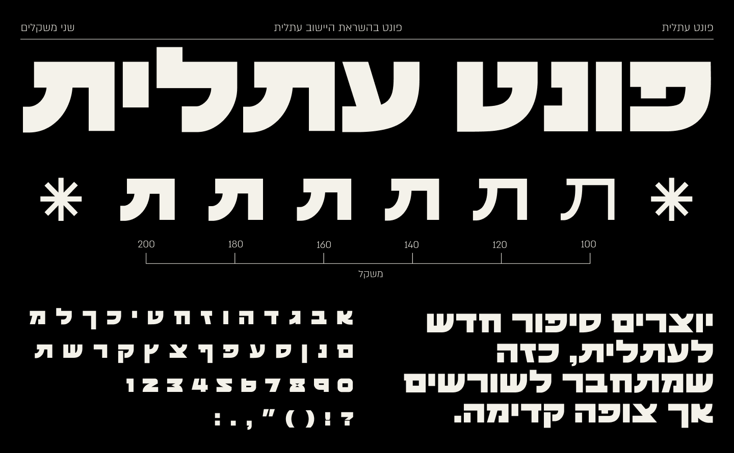
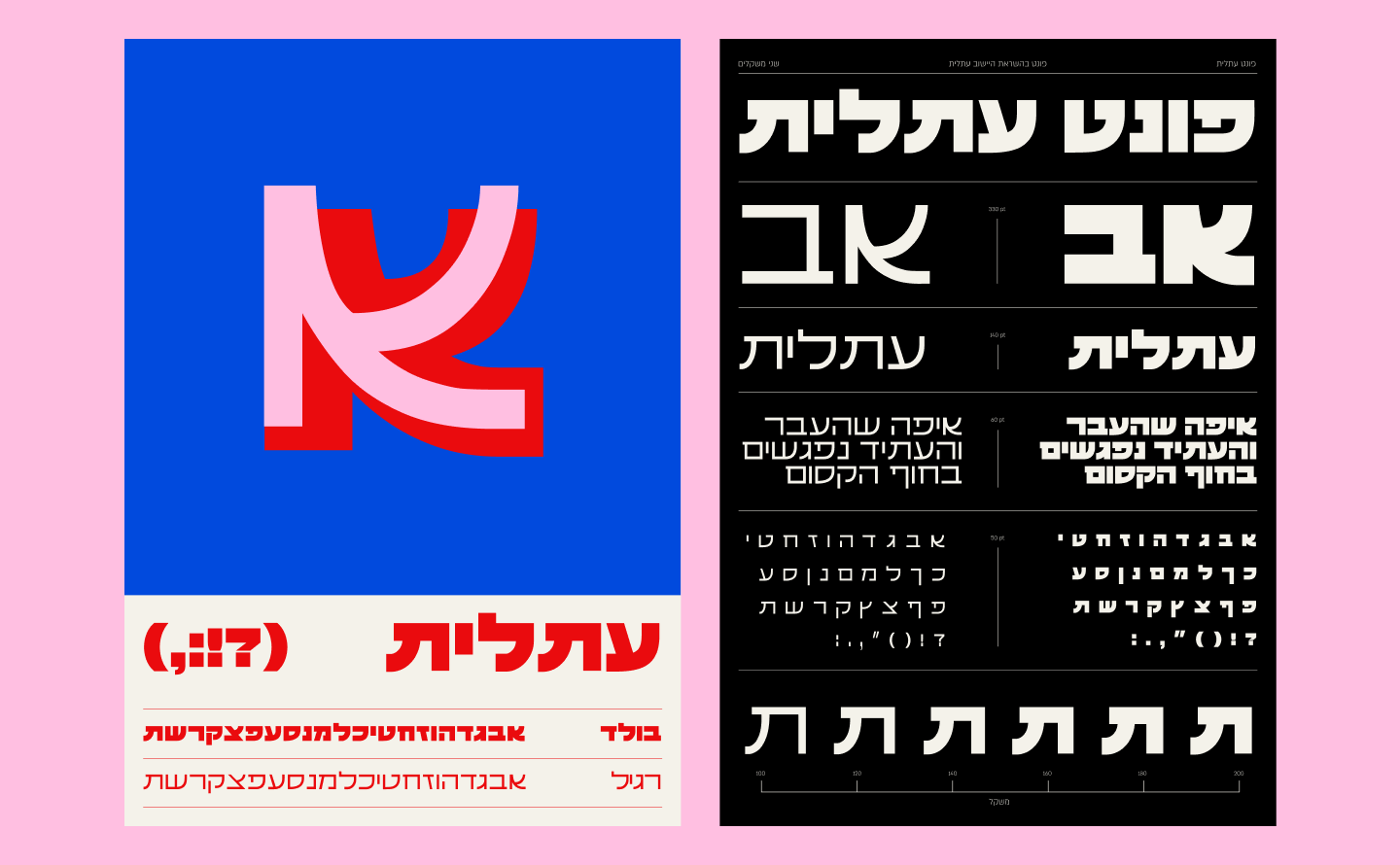
The "Atlit" typeface was created as part of a city rebranding, connecting the community's past and future. Developed through in-depth research of the old logo designed by Dror Ben Dov, the typeface honors the city’s history while incorporating modern, precise design. It blends rounded letterforms inspired by the soft landscapes of salt pools and the sea, with the Byzantine influence of ancient local script. Drawing from regional calligraphic styles, it merges traditional elements with clean, digital-friendly lines.
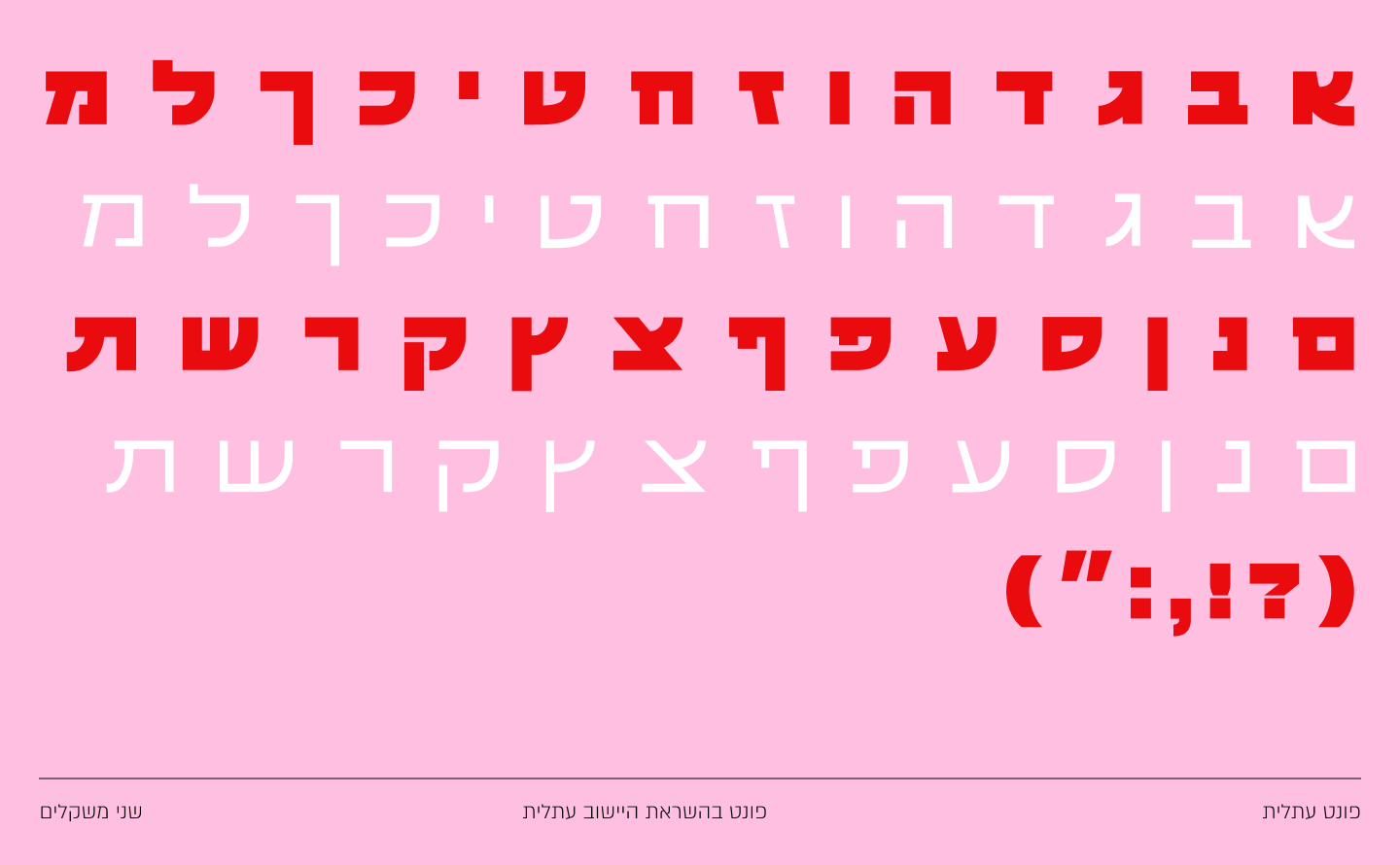
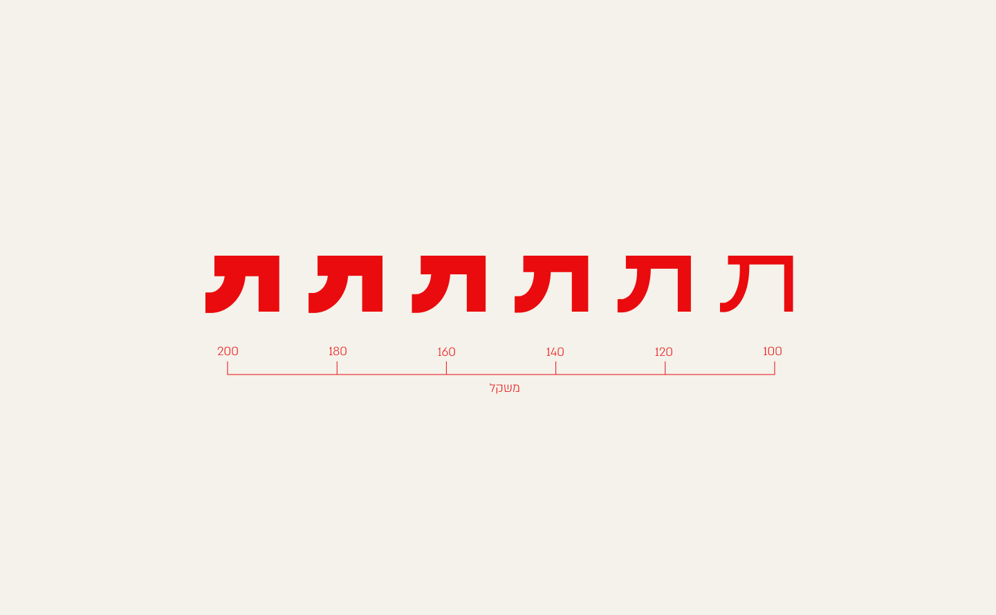
Each letter was designed with readability in mind, balancing accessibility and cultural depth. The typeface reflects Atlit’s core values of community warmth, intergenerational connection, and a forward-looking vision. Used in signage, logos, and social media, it creates a visual language that seamlessly links the past and present, symbolizing Atlit's journey as a city where letters tell the story