Most people think a rainbow is just a half-circle, but in reality, it’s a full circle—our perspective from the ground limits what we see. The same goes for design and development; they aren’t separate worlds but two halves of a whole. Rainbow exists to bridge that gap.
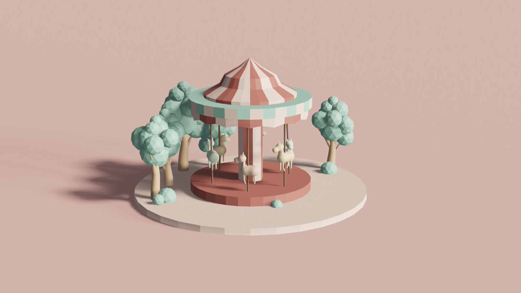
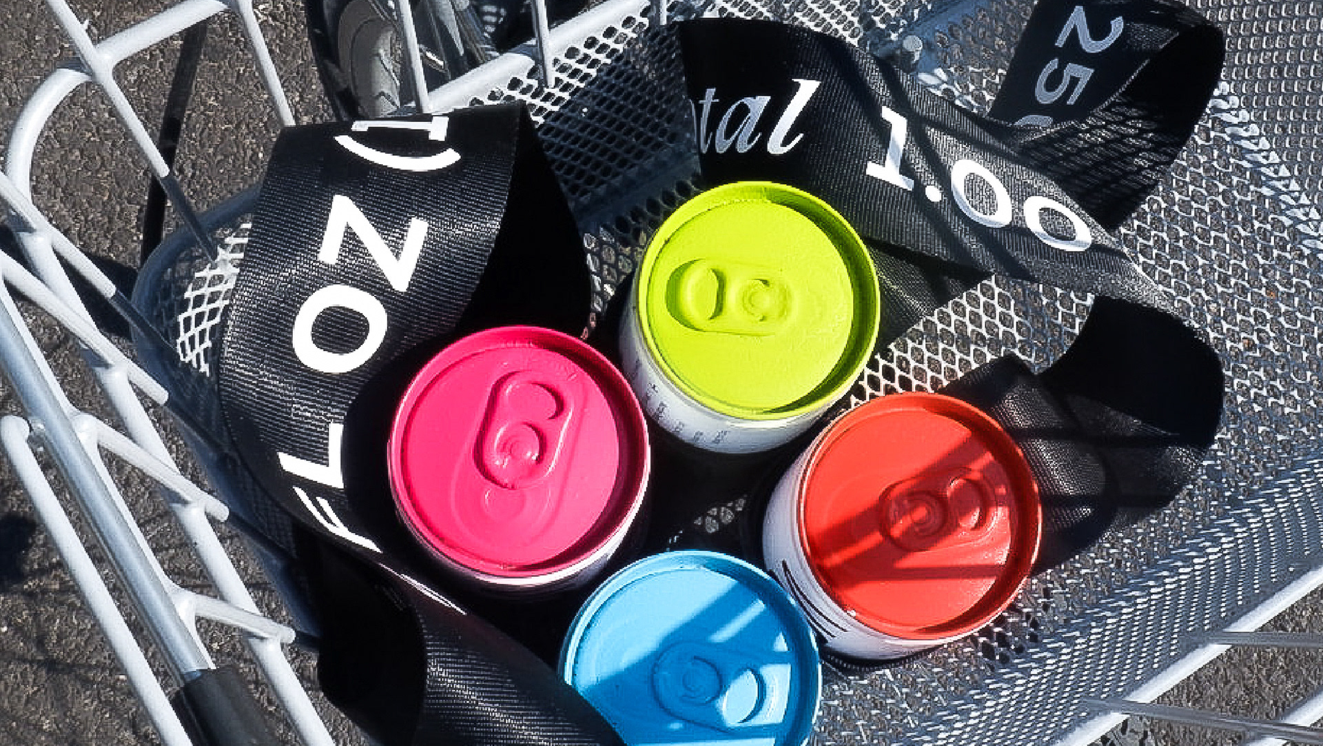
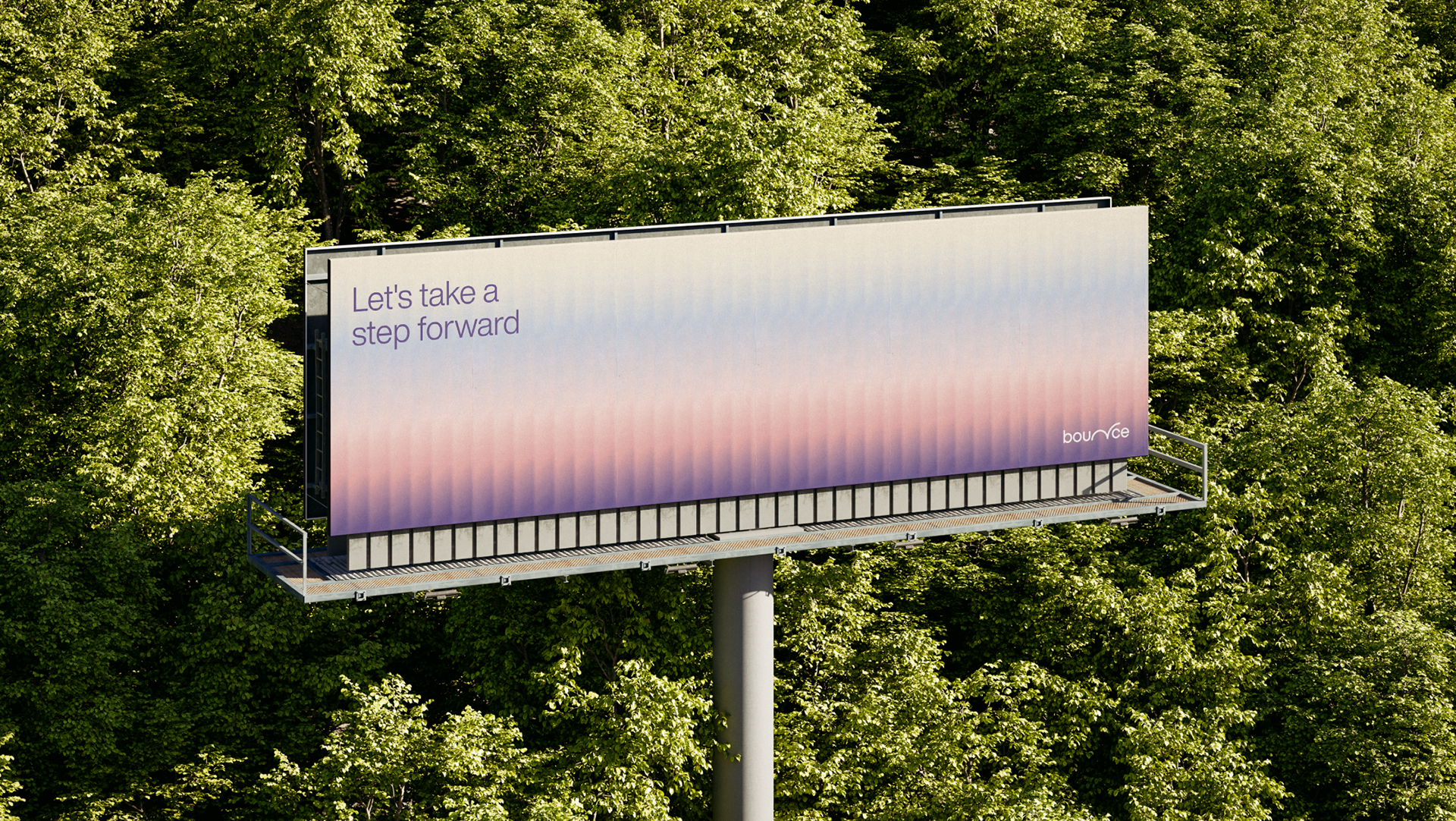
In designing Rainbow, we focused on three principles: simplicity, flexibility, and openness. It’s playful and intuitive, like building blocks, with a clean, spacious design ready for AI. We used plenty of white space to represent the empty canvas—endless in its possibilities. It’s limitless—a code editor and an open canvas where anything is possible. And like its name, it connects seamlessly, using color sparingly but meaningfully.
Branding designed as part of studio under.
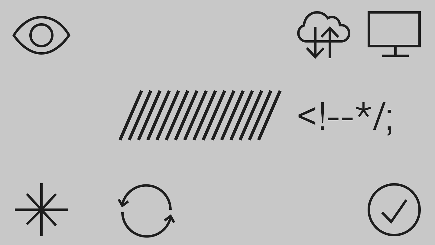
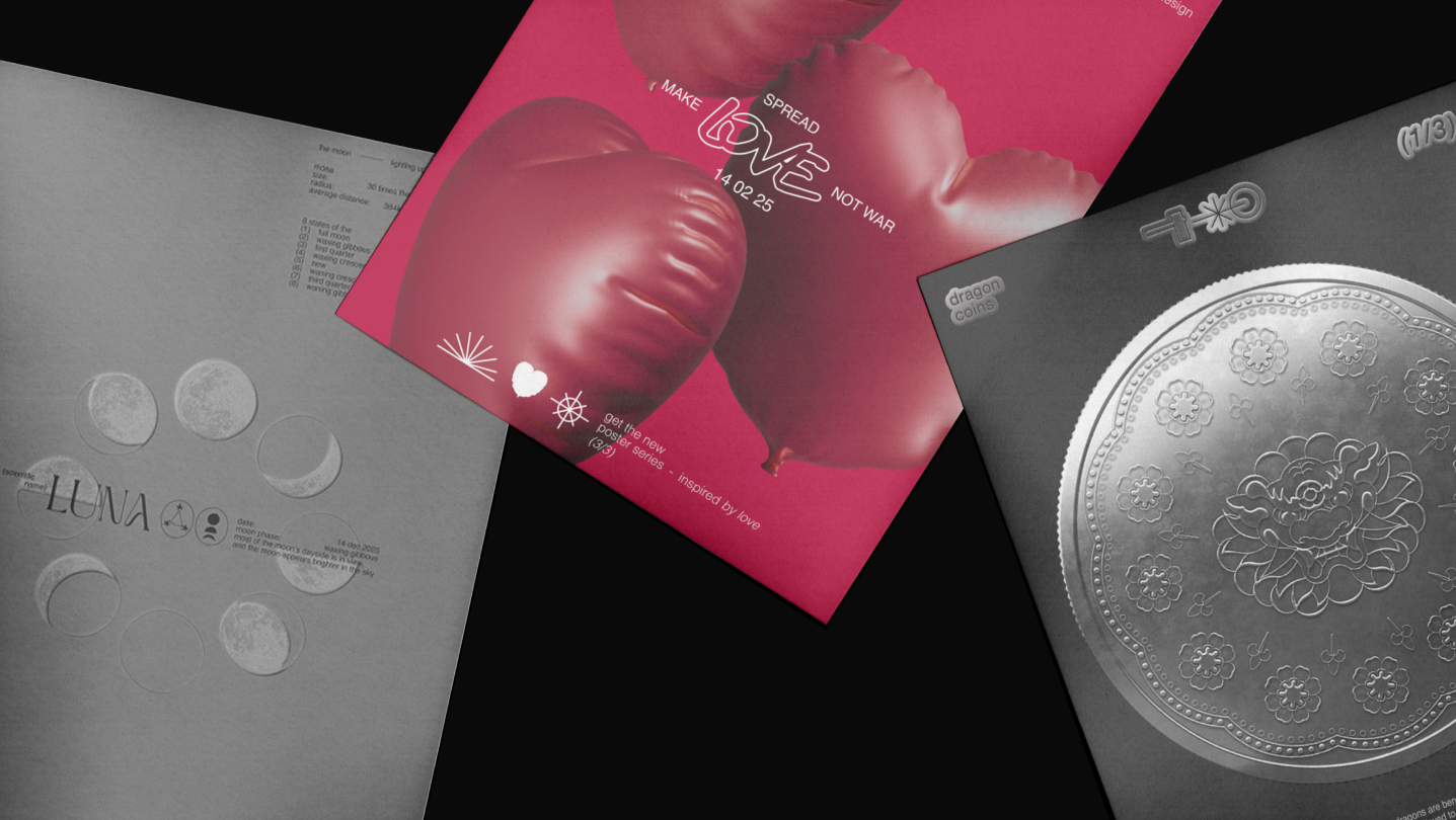
As the Brand Designer for this project, I created the branding elements, including poster design, icon design, and other visual elements.
As the Brand Designer for this project, I created the branding elements, including poster design, icon design, and other visual elements.
